Visuals - Style
From VersaVision Support
A Style is a customized cell appearance the user can design. This includes multiple options.
Once a Style is created it can be selected on one or more Dashboards or Widgets. This makes editing a color a 1-stop event rather than having to edit every cell on every dashboard/widget.
This page will provide information on each option that can be accessed on the Styles page.
The New Style or Edit Style page can be accessed from the Main Styles page by selecting to Add a New Style or Edit/Duplicate a Style.
Each Style must have a Name entered in the Name field. Click in the Name field to enter a name.
Each Style can have a description entered, this is an optional field. Click in the Description field to setup a description for the style.
The Advanced toggle allows the user to use CSS to define the cell appearance. We do not suggest using this feature unless the user is knowledgeable in the CSS language/code.
If there is a Style with Advanced settings, please contact VersaCall Support for assistance.
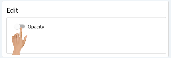
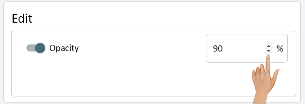
The Opacity setting will be universal on the cell, meaning it will apply the setting to all options Text, Border and Background. By default, Opacity is set to 100%.
Click on the Opacity toggle, in the Edit list, to enable custom settings.
Click in the cell to type in the value or use the arrows to increase/decrease the value. Enter the best value for the Style being created.
The Border has 4 separate options available:
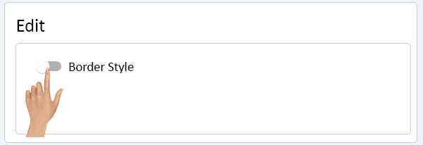
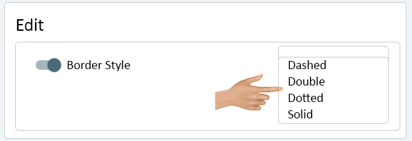
- Border Style - allows the user to define what the Border will be (Dashed, Double, Dotted or Solid).
- Border Width - allows the user to define how thick the Border selected will be.
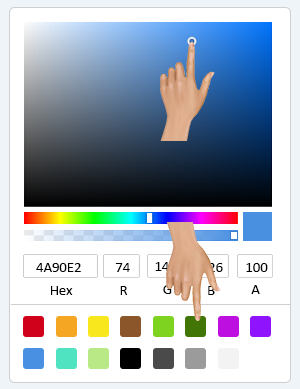
- Border Color - allows the user to define the color of the Border selected.
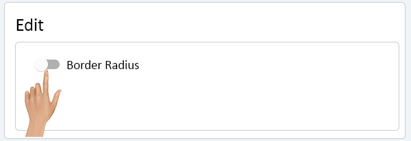
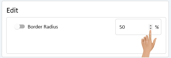
- Border Radius - allows the user to round the corners of the cell.
Click on the Border Style toggle, in the Edit list, to enable custom settings.
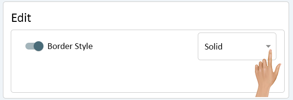
Click on the down arrow.
A list will show with 4 options. Select the best option for the Style being created.
- Dashed - this will present the Border as a dashed line.
- Double - this will present the Border as a double line.
- Dotted - this will present the Border as a dotted line.
- Solid - this will present the Border as a solid line.
Click on the Border Width toggle, in the Edit list, to enable custom settings.
Click in the cell to type in the value or use the arrows to increase/decrease the value. Enter the best value for the Style being created.
Click on the Border Color toggle, in the Edit list, to enable custom settings.
Click on the color swatch.
On the color pallet, select a color swatch or use the mixer to make a color.
Click on the Border Radius toggle, in the Edit list, to enable custom settings.
Click in the cell to type in the value or use the arrows to increase/decrease the value. Enter the best value for the Style being created.
The Background settings apply to the background of the cell. There are 2 options available:
- Background Color - allows the user to define a solid color for the cell.
- Fade Background Color - allows the user to define a color fade that creates a blinking effect.
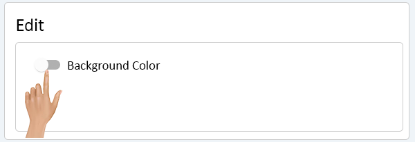
Click on the Background Color toggle, in the Edit list, to enable custom settings.
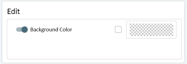
Click on the color swatch.
On the color pallet, select a color swatch or use the mixer to make a color.
To make the Background Color Transparent, uncheck the checkmark.
The color swatch will show as a checkered box.
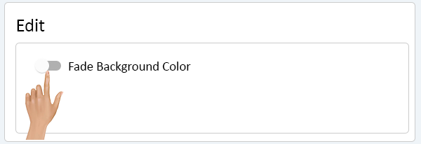
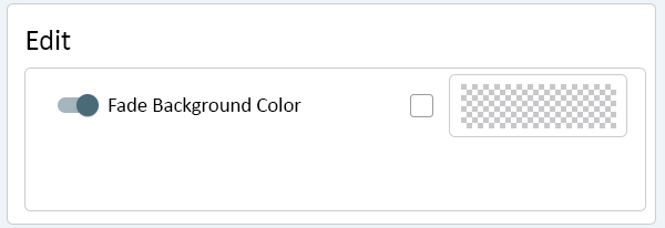
Click on the Fade Background Color toggle, in the Edit list, to enable custom settings.
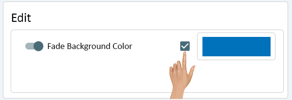
Click on the color swatch.
On the color pallet, select a color swatch or use the mixer to make a color.
To make the Fade Background Color Transparent, uncheck the checkmark.
The color swatch will show as a checkered box.
The Padding settings allow the user to indent the text presented in the cell. There are 2 options available:
- Horizontal Padding - allows the user to define how far to indent the text from the left side of the cell.
- Vertical Padding - allows the user to define a how far to indent the text from the top of the cell.
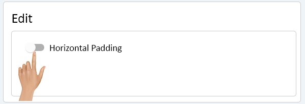
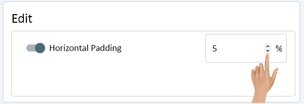
Click on the Horizontal Padding toggle, in the Edit list, to enable custom settings.
Click in the cell to type in the value or use the arrows to increase/decrease the value. Enter the best value for the Style being created.
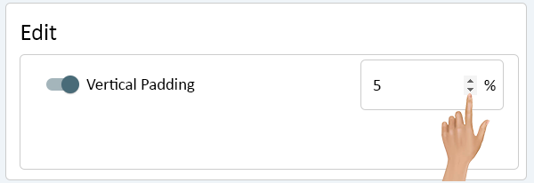
Click on the Vertical Padding toggle, in the Edit list, to enable custom settings.
Click in the cell to type in the value or use the arrows to increase/decrease the value. Enter the best value for the Style being created.
The Alignment settings allow the user to define where the text will appear in the cell. There are 2 options available:
- Horizontal Align - allows the user to define where the text will show in the cell horizontally.
- Vertical Align - allows the user to define where the text will shown in the cell vertically.
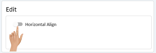
Click on the Horizontal Align toggle, in the Edit list, to enable custom settings.
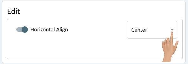
Click on the down arrow.
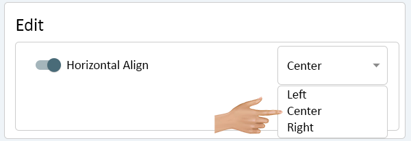
A list will show with 3 options. Select the best option for the Style being created.
- Left - this will place the text on the left side of the cell.
- Center - this will place the text in the center of the cell.
- Right - this will place the text on the right side of the cell.
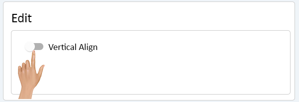
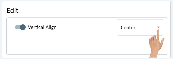
Click on the Vertical Align toggle, in the Edit list, to enable custom settings.
Click on the down arrow.
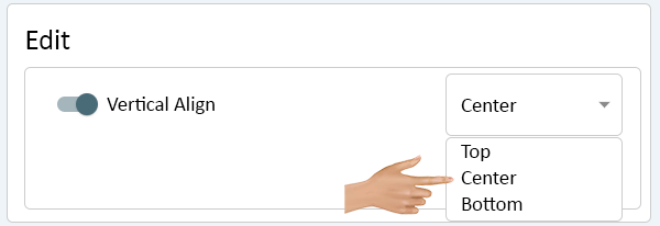
A list will show with 3 options. Select the best option for the Style being created.
- Top - this will place the text at the top of the cell.
- Center - this will place the text in the center of the cell.
- Bottom - this will place the text at the bottom of the cell.
The Font settings allow the user to define what the text will look like in the cell. There are 7 options available:
- Font Color - allows the user to define the color of the text.
- Font Fade Color - allows the user to define a color fade that creates a blinking effect.
- Font Family - allows the user to define the Font type used.
- Font Size - allows the user to define how large the text will be in the cell.
- Font Style - allows the user to define a style for the text (Italic or Normal).
- Font Weight - allows the user to define how thick the text is (Bold or Normal).
- Text Decoration - allows the user to add lines to the text (Underlined or Overlined).
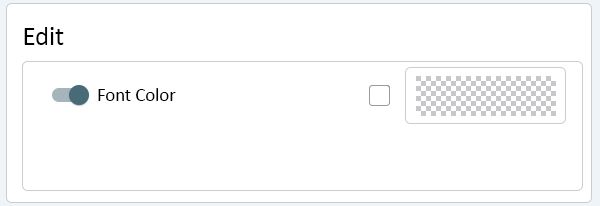
Click on the Font Color toggle, in the Edit list, to enable custom settings.
Click on the color swatch.
On the color pallet, select a color swatch or use the mixer to make a color.
To make the Font Color Transparent, uncheck the checkmark.
The color swatch will show as a checkered box.
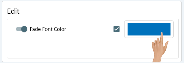
Click on the Fade Font Color toggle, in the Edit list, to enable custom settings.
Click on the color swatch.
On the color pallet, select a color swatch or use the mixer to make a color.
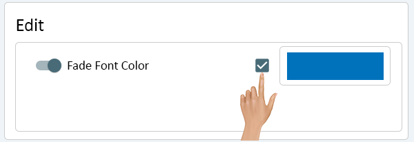
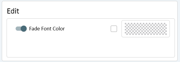
To make the Fade Font Color Transparent, uncheck the checkmark.
The color swatch will show as a checkered box.
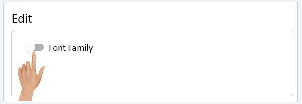
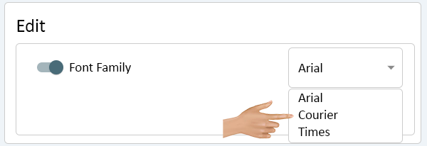
Click on the Font Family toggle, in the Edit list, to enable custom settings.
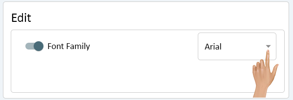
Click on the down arrow.
A list will show with 3 options. Select the best option for the Style being created.
- Arial - this will use the Arial Regular Font type for the text.
- Courier - this will use the Courier Regular Font type for the text.
- Times - this will use the New Times Roman Regular Font type for the text.
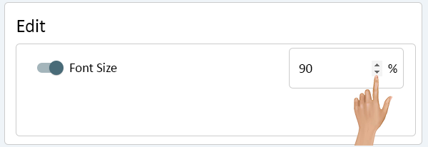
Click on the Font Size toggle, in the Edit list, to enable custom settings.
Click in the cell to type in the value or use the arrows to increase/decrease the value. Enter the best value for the Style being created.
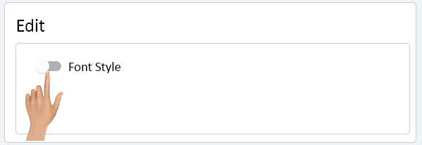
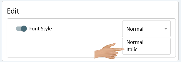
Click on the Font Style toggle, in the Edit list, to enable custom settings.
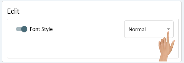
Click on the down arrow.
A list will show with 2 options. Select the best option for the Style being created.
- Normal - text will show as normal/regular Font.
- Italic - text will show as a Italic Font.
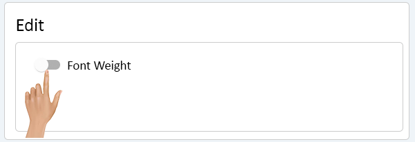
Click on the Font Weight toggle, in the Edit list, to enable custom settings.
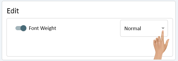
Click on the down arrow.
A list will show with 2 options. Select the best option for the Style being created.
- Normal - text will show as normal/regular Font.
- Bold - text will show as a Bold Font.
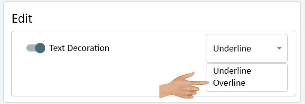
Click on the Text Decoration toggle, in the Edit list, to enable custom settings.
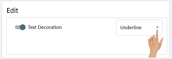
Click on the down arrow.
A list will show with 2 options. Select the best option for the Style being created.
- Underline - this will place a line under the text.
- Overline - this will place line over the text.


