Visuals - Cell Position
From VersaVision Support
The Cell Position is an element that only applies to Freehand Widgets and Dashboards. This property is used to define where the cell is to be places on the layout and the size of the cell.
This page will explain the options associated with position, height and width of a cell.
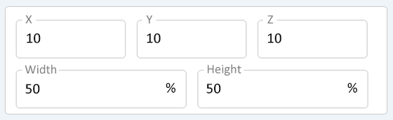
The Cell Position deals with the X, Y, Z, Width and Height section of the Cell Properties.
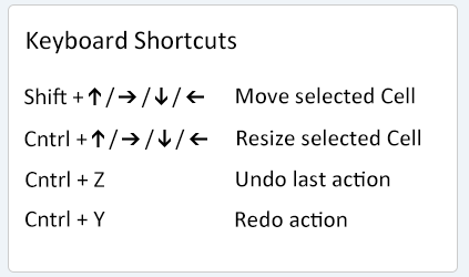
The Details below will explain how to manually adjust the position and size of a cell. The user can also use the keyboard to adjust the settings.
The image below shows the keyboard shortcuts available.
|
|
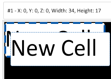
The X propertiy defines where the LEFT side of the cell is to reside on the layout. Click in the X field to change the setting.
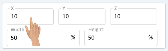
The X field allows the user to either type in a value or use the arrow buttons to increase/decrease the value. Set the alignment that is needed for the cell.
- NOTE: The layout is a 100 x 100 square.
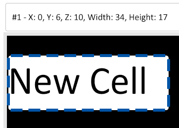
- Example: If the cell needs to be set to the left side of the layout, X position would be "0".
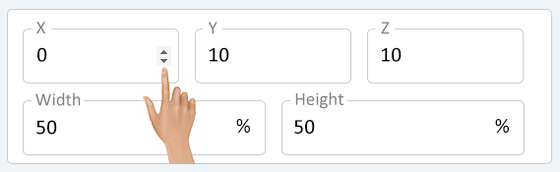
The image below shows how the cell would appear on the layout when set to "0" as the X position.
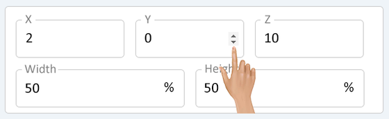
The Y property defines where the TOP of the cell is to reside on the layout. Click in the Y field to change the setting.
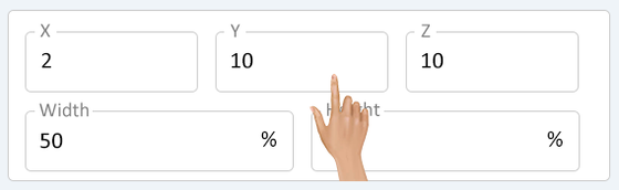
The Y field allows the user to either type in a value or use the arrow buttons to increase/decrease the value. Set the alignment that is needed for the cell.
- NOTE: The layout is a 100 x 100 square.
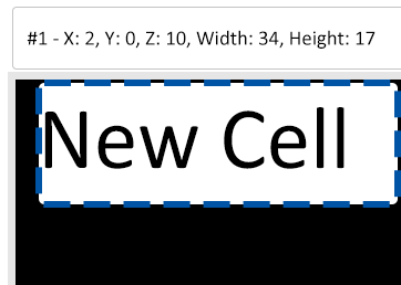
- Example: If the cell needs to be set at the top of the layout, Y position would be "0".
The image below shows how the cell would appear on the layout when set to "0" as the Y position.
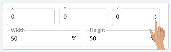
The Z property defines the order of the cell on the layout when cells are layered. Click in the Y field to change the setting.
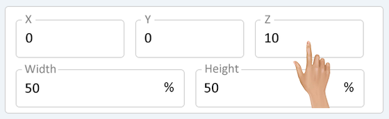
The Z field allows the user to either type in a value or use the arrow buttons to increase/decrease the value. Set the visibility that is needed for the cell.
- Example: If the cell needs to be the background, the Z would be set to "0".
The image below shows how the cell would appear on the layout when one cell is set to "0" Z position and another is set to "1" Z position.
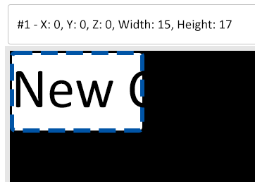
The Width property defines how wide the cell is to be. Click in the Width field to change the setting.
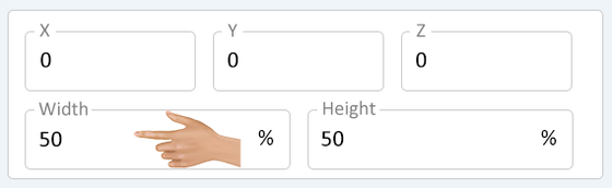
The Width field allows the user either type in a value or use the arrow buttons to increase/decrease the value. Set the width that is needed for the cell.
- NOTE: The layout is a 100 x 100 square.
- Example: If the cell needs to have a width of 15%, the Width would be "15".
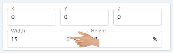
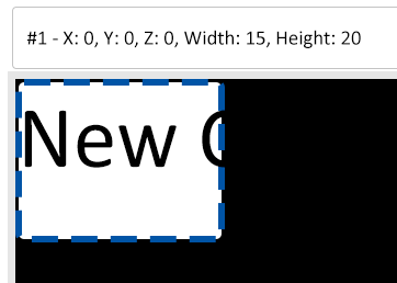
The image below shows how the cell would appear on the layout when set to a 15% Width.
The Height property defines how tall the cell is to be. Click in the Height field to change the setting.
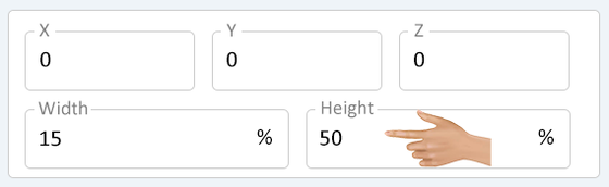
The Height field allows the user either type in a value or use the arrow buttons to increase/decrease the value. Set the height that is needed for the cell.
- NOTE: The layout is a 100 x 100 square.
- Example: If the cell needs to have a height of 20%, the Height would be "20".
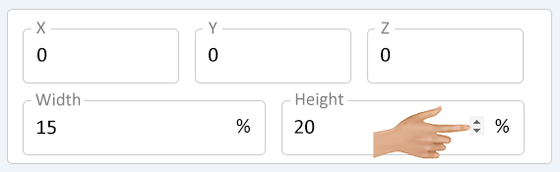
The image below shows how the cell would appear on the layout when set to a 20% Height.
|
|
 |

|
|