Visuals - Cell Appearance
From VersaVision Support
The Cell Appearance is an element that applies to Widgets and Dashboards. This property is used to define Alignment, Font, Font Type, Font Size, Font Style, Font Color, Background Color and Visibility or items in a cell.
This page will explain the options associated with all of the items mentioned above.
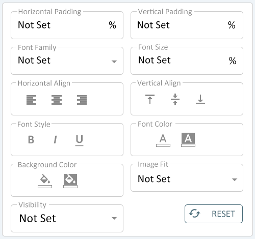
The Cell Appearance deals with the Horizontal Padding, Vertical Padding, Font Family, Font Size, Horizontal Align, Vertical Align, Font Style, Font Color, Background Color, Image Fit and Visibility sections of Cell Properties.
 |
|
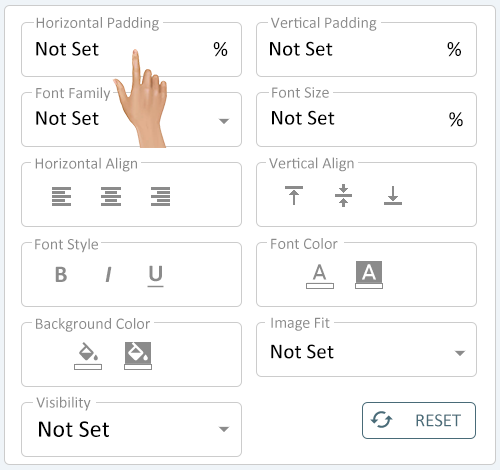
The Horizontal Padding property gives the user the ability to Left-Indent the value of the cell. Click in the Horizontal Padding field to change the setting.
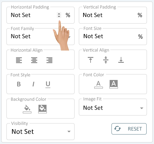
The Horizontal Padding field allows the user to either type in a value or use the arrow buttons to increase/decrease the value. Set the indent value that is needed for the cell.
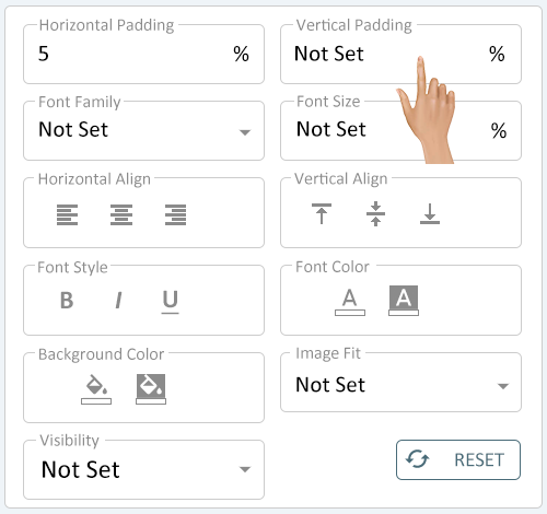
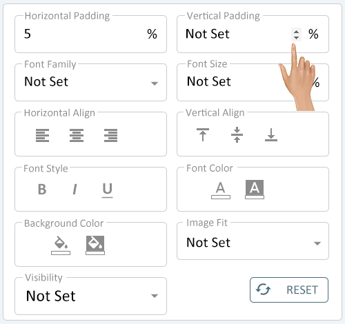
The Vertical Padding property gives the user the ability to Top-Indent the value of the cell. Click in the Vertical Padding field to change the setting.
The Vertical Padding field allows the user to either type in a value or use the arrow buttons to increase/decrease the value. Set the indent value that is needed for the cell.
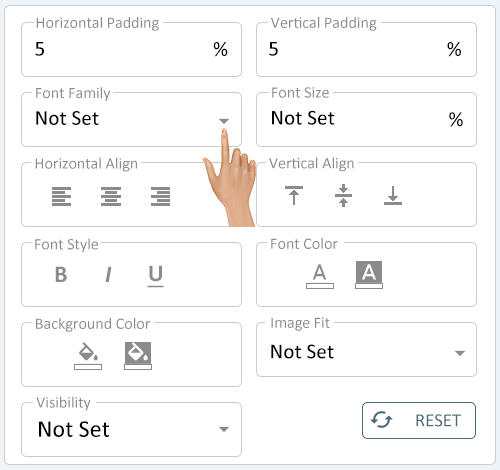
The Font Family property gives the user the ability to define the font that will be used for the cell value. Click on the down arrow in the Font Family field.
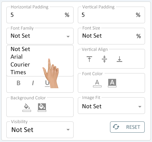
The default setting is "Not Set" as this would indicate the cell will follow the Style assigned to it. If a style is not assigned to the cell, the system will default to the Arial Font.
The a list of 3 Fonts will load below the field. Select the font needed for the cell.
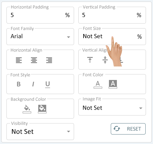
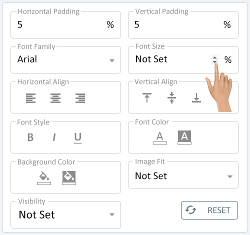
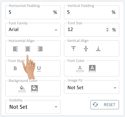
The Font Size property allows the user to define how large the font, for the cell value, will be. Click in the Font Size field.
The default setting is "Not Set" as this would indicate the cell will follow the Style assigned to it. If a style is not assigned to the cell, the system will default a 12% size.
- NOTE: The Font Size is done as a percentage of the cell.
The Font Size field allows the user to either type in a value or use the arrow buttons to increase/decrease the value. Set the size that is needed for the cell.
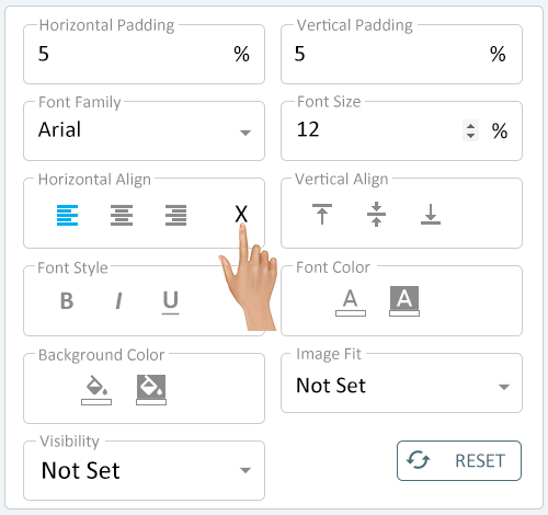
The Horizontal Alignment property allows the user to define the alignment, Left, Right or Center, of the cell value. Click on the icon for the alignment needed for the cell.
The default setting is "Not Set" as this would indicate the cell will follow the Style assigned to it. If a style is not assigned to the cell, the system will default to Left Cell Alignment.
The alignment selected will highlight. A reset option "X" will load on the right side of the field. To reset the alignment to None, click on the "X"
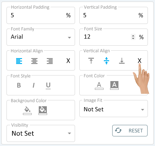
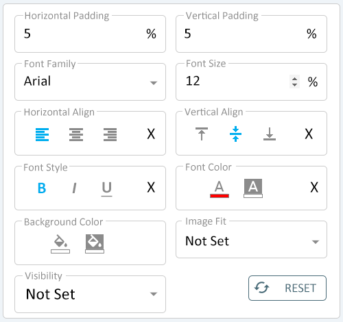
The Vertical Alignment property allows the user to define the alignment, Top, Middle, or Bottom, of the cell value. Click on the icon for the alignment needed for the cell.
The default setting is "Not Set" as this would indicate the cell will follow the Style assigned to it. If a style is not assigned to the cell, the system will default to Middle Cell Alignment.
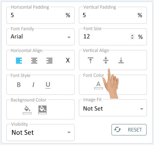
The alignment selected will highlight. A reset option "X" will load on the right side of the field. To reset the alignment to None, click on the "X"
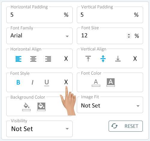
The Font Style property allows the user to define the font appearance, Bold, Italics and Underlined. Click on the style needed for the cell.
The default setting is "Not Set" as this would indicate the cell will follow the Style assigned to it. If a style is not assigned to the cell, the system will default to No Style.
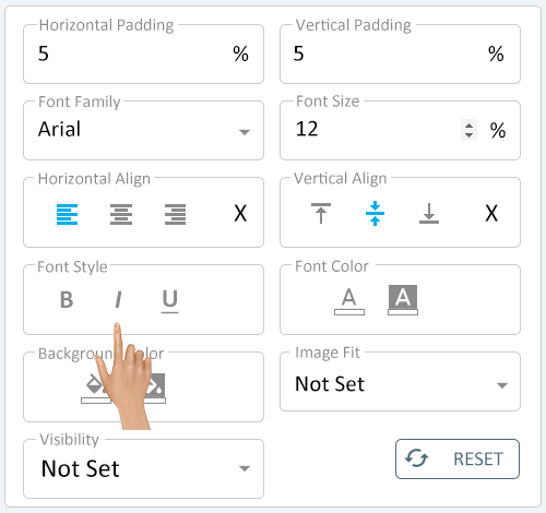
The Style selected will highlight. A reset option "X" will load on the right side of the field. To reset the style to None, click on the "X"
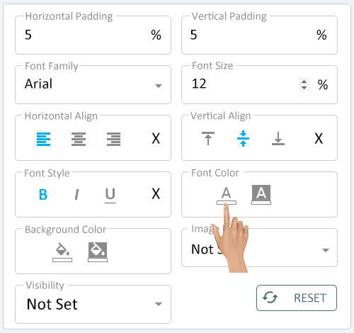
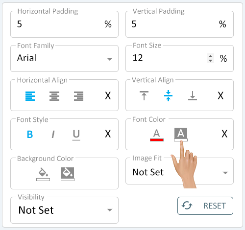
The Font Color property allows the user to define the Color of the text for the cell value. Select the Font Color icon.
There are 2 colors that can be selected:
- Font Color - this will set the constant color of the font in the cell.
- Font Fade Color - this will set the color that the font will fade to in the cell.
The default setting, on both options, is "Not Set" as this would indicate the cell will follow the Style assigned to it. If a style is not assigned to the cell, the system will default to Black Font Color and No Fade.
The Color Pallet will load. Use the picker or pre-made swatches to set the color of the Font.
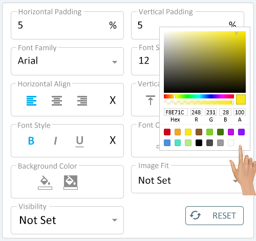
The Color selected will show on the icon and a reset option "X" will load on the right side of the field. To reset the color to None, click on the "X"
Select the Font Fade Color icon to change it. Use the Color Pallet to pick a color or select a pre-made color.
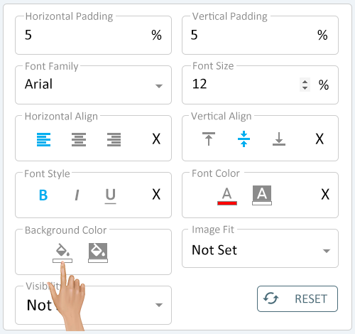
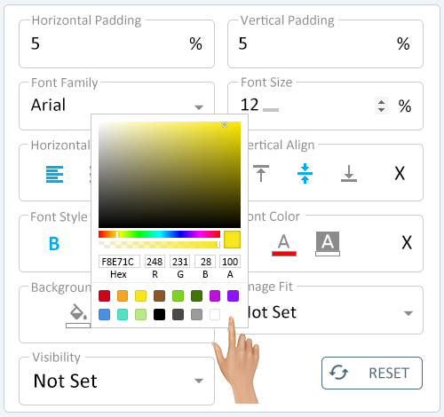
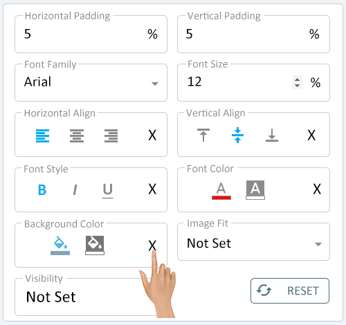
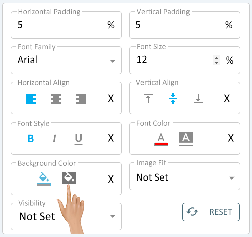
The Background Color property allows the user to define the Color of the cell. Select the Background Color icon.
There are 2 colors that can be selected:
- Background Color - this will set the constant color of the cell.
- Fade Background Color - this will set the color that the cell will fade to.
The default setting, on both options, is "Not Set" as this would indicate the cell will follow the Style assigned to it. If a style is not assigned to the cell, the system will default to White Background Color and No Fade.
The Color Pallet will load. Use the picker or pre-made swatches to set the cell color.
The Color selected will show on the icon and a reset option "X" will load on the right side of the field. To reset the color to None, click on the "X"
Select the Fade Background Color icon to change it. Use the Color Pallet to pick a color or select a pre-made color.
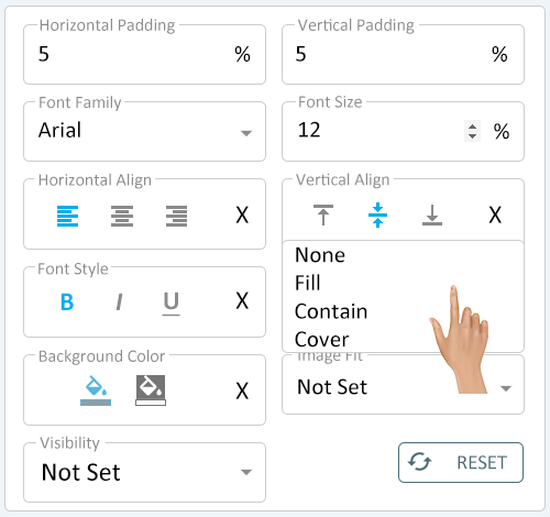
The Image Fit property allows the user to define how an image will fill the cell. Select the down arrow in the Image Fit field.
The default setting is "Not Set" as this would indicate the cell will follow the Style assigned to it. If a style is not assigned to the cell, the system will default to the "None" setting.
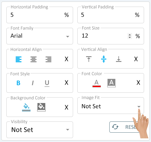
A menu will load with 4 options - select the best option for the cell being created.
- None - this option will not restrict the image in anyway.
- Fill - this option will make the image fill the entire cell. This option can cause the image to skew.
- Contain - this option will confine the image to the cell. This image can cause unused cell space.
- Cover - this option will make the image expand to completely cover the cell. This option can cause the image to be cut off.
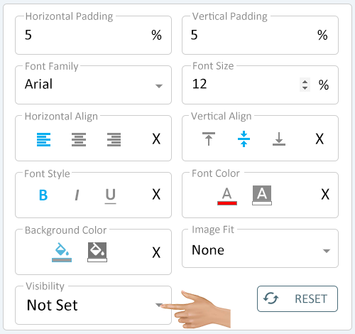
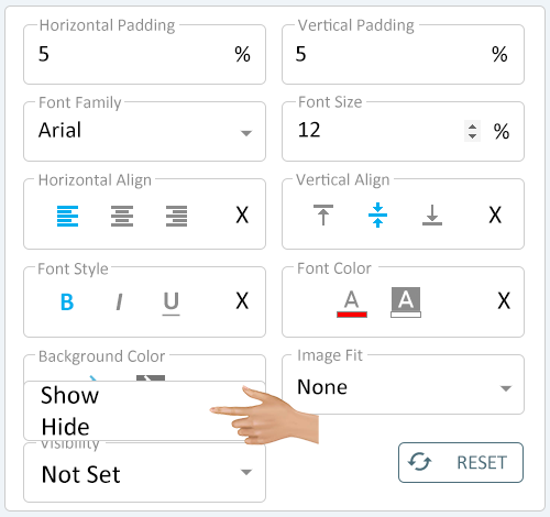
The Visibility property allows the user to define if the cell is shown on the layout by default. Select the down arrow in the Visibility field.
The default setting, is "Not Set" as this would indicate the cell will follow the Style assigned to it. If a style is not assigned to the cell, the system will default to Show.
A menu will load with 2 options - select the best option for the cell being created.
- Show - this option will make the value of the cell show on the layout by default.
- Hide - this option will make the value of the cell unseen or hidden on the layout by default
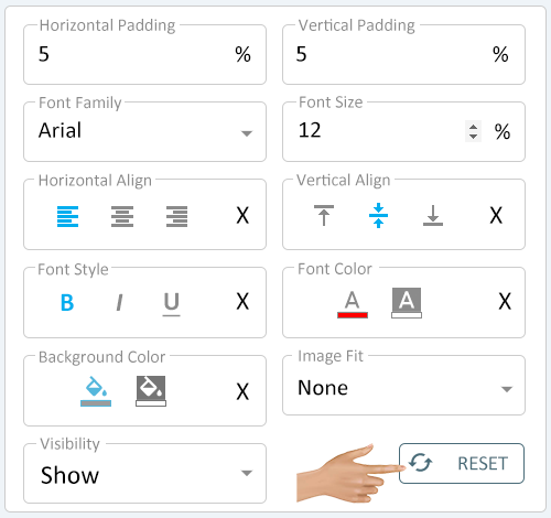
If the user needs to reset the cell back to default, click on the Reset button. All defaults will be restored to all of the Appearance settings.
|
|
 |

|
|