Visuals - Cell Style
From VersaVision Support
Cell Styles is an element that applies to Widgets and Dashboards. This property allows the user to assign a pre-made style to a cell.
The style assigned using this element wouldbe the default style. If there are conditions, those styles would override the default style when they are active.
This page will explain the setup of a Style on a cell.
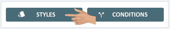
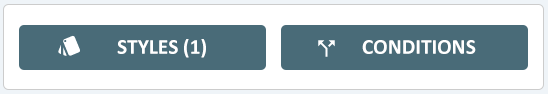
Cell Styles are accessed using the Styles button at the bottom of the Cell Properties menu.
 |
|
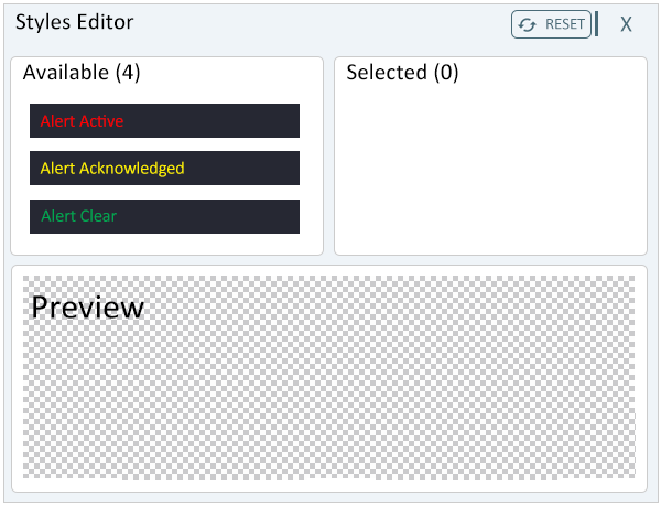
When Styles is selected for the cell, a Style Editor window will load. The editor has 3 main sections:
- Available - this is a list of all pre-made styles created/loaded into the system.
- Selected - once a style is selected, it will appear in the Selected field.
- Preview - the style that has been selected will show a thumbnail view in this area.
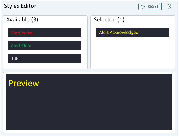
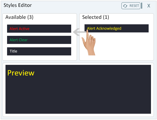
To select a style, drag and drop it from the Available list into the Selected list.
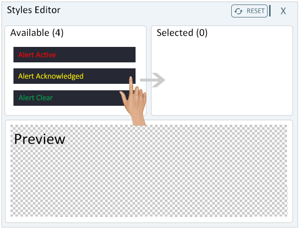
The style selected will now show in the Selected list and a thumbnail view, of the selected style, will appear in the Preview area.
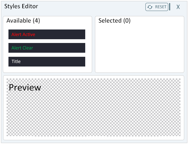
To remove a selected style the user can drag and drop it over to the Available list.
The style that was selected to be moved will no longer show in the Selected list.
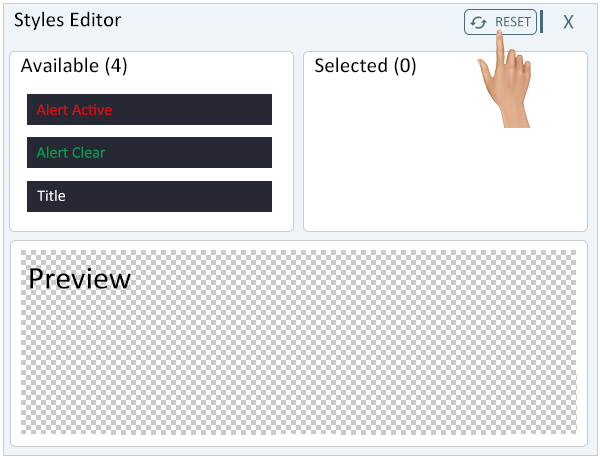
To reset the style to default, click on the Reset button at the top of the window.
The default setting is No Color/Transparent background with Black text. The grey checkered background indicated no color/transparent.
Once the Style has been selected, click on the "X" in the top right of the window to close the Style Editor.
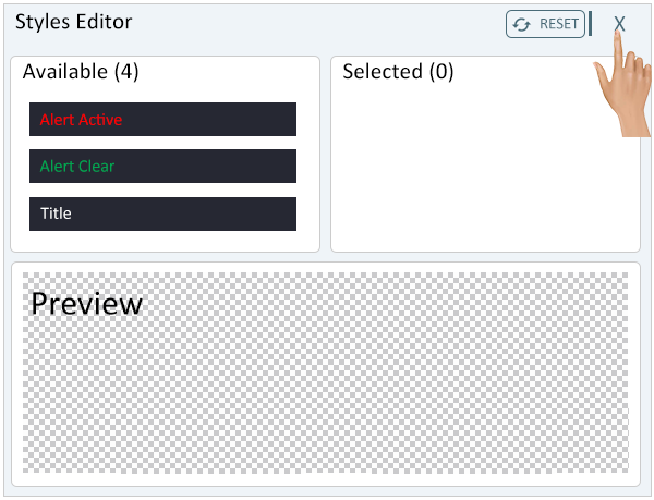
The Styles button will now indicate that a style has been selected for the cell.
|
|
 |

|
|