Visuals - Cell Type - Main
From VersaVision Support
A Cell on a Widget or Dashboard can be setup as different types. Each type has a specific function and purpose
Dashboards can be setup as 1 of 4 types. Widgets can be setup as 1 of 3 types. Each type is explained below and has a link to in depth information.
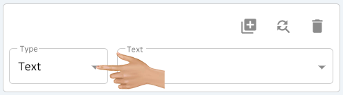
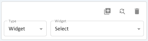
With a Cell selected on the Dashboard or Widget - click on the down arrow in the Type field to access available types.
|
|
- TYPE - TEXT
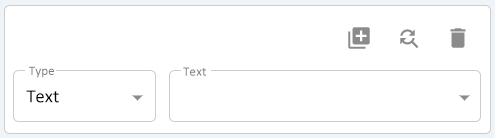
The Text Type is setup as the default. Use this type when the cell needs to be setup to display text or the result of a variable.
- Usage - Dashboards and Widgets.
- Click Here for information.
- Usage - Dashboards and Widgets.
- TYPE - URL
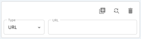
The URL Type is used when the cell needs to be setup to display a web page. Generally, this would be used when the user wants to display the Module Location Interface on a Dashboard.
- Usage - Dashboards and Widgets.
- Click Here for information.
- Usage - Dashboards and Widgets.
- TYPE - IMAGE
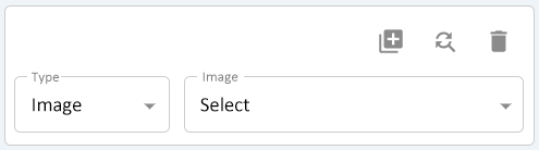
The Image Type is used when the cell needs to be setup to display an image or graphic. Generally, his would be used to insert a logo on a Dashboard.
- Usage - Dashboards and Widgets.
- Click Here for information.
- Usage - Dashboards and Widgets.
- TYPE - WIDGET
The Widget Type is used to display a widget on a Dashboard.
- Usage - Dashboards Only.
- Click Here for information.
- Usage - Dashboards Only.
|
|
 |

|
|